Personnalisez Bonjourr au-delà des réglages intégrés avec des extraits CSS prêts à l'emploi pour les couleurs, les widgets, les arrière-plans et plus encore.
Les réglages intégrés de Bonjourr couvrent la plupart des besoins de personnalisation, mais les extraits CSS permettent d’aller encore plus loin. Copiez-collez simplement un extrait dans la section CSS personnalisé pour modifier ou étendre l’apparence de Bonjourr.
Comment utiliser les extraits CSS ?
Section intitulée « Comment utiliser les extraits CSS ? »Couleurs et icônes
Section intitulée « Couleurs et icônes »Ajouter ou modifier des couleurs
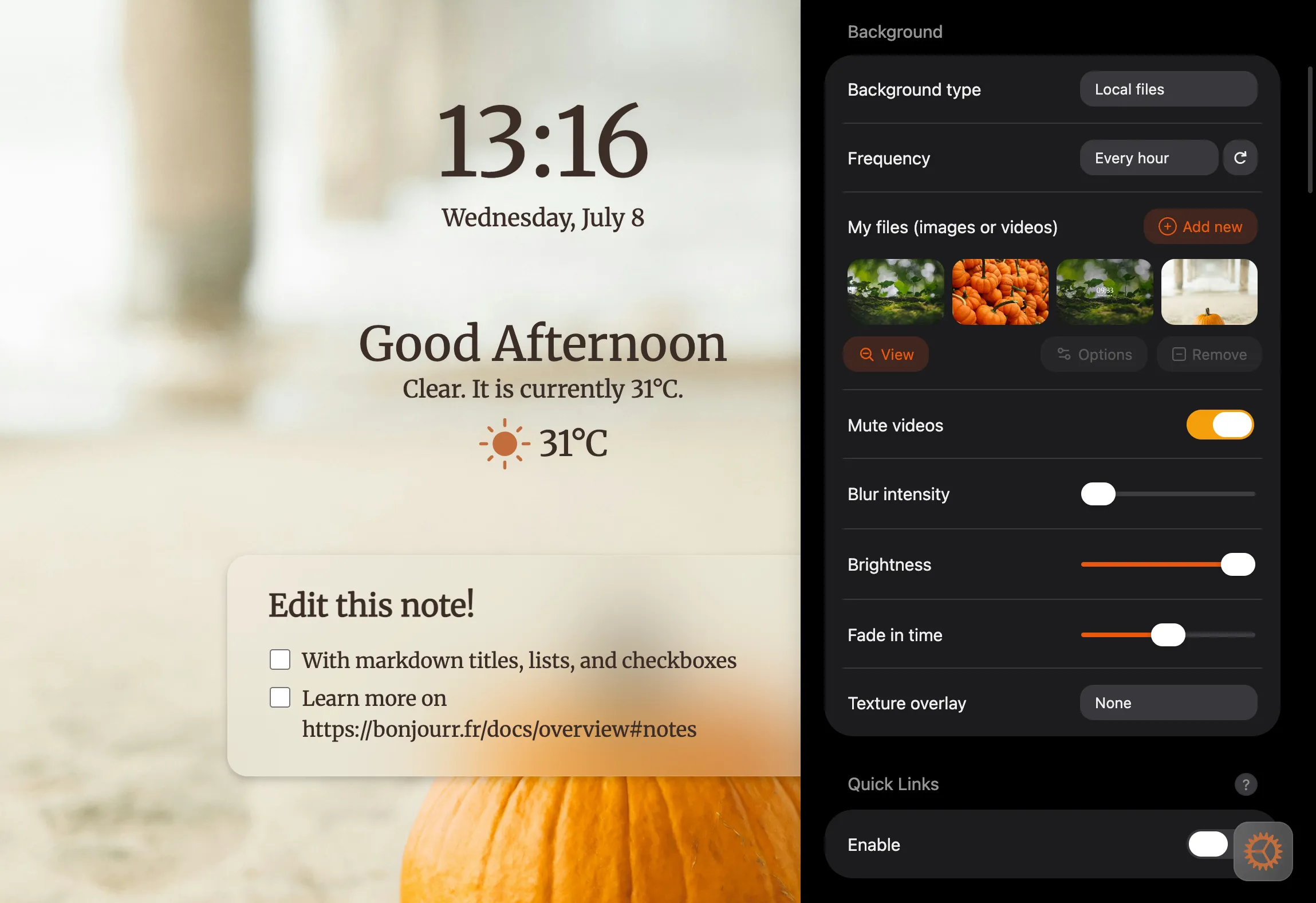
Section intitulée « Ajouter ou modifier des couleurs »Grâce aux variables CSS, vous pouvez facilement modifier les couleurs des polices et des icônes dans Bonjourr.
Voir l’extrait CSS
:root {  /* overrides the built-in font color option (only rgb values) */  --font-color: 60 45 40!important;
  /* for text on blurry elements (notes, searchbar... (only rgb values)) */  --font-on-blur-color: 60 45 40;
  /* weather & settings icon (any kind of color code) */  --icon-color: #c26d3b;
  /* the following are mostly just for the settings ⤵️ */  /* blue accents all over (only rgb values) */  --accent-color: 234 88 12;
  /* settings toggles (only rgb values) */  --color-green: 245 158 11;}
Personnaliser les couleurs des widgets individuellement
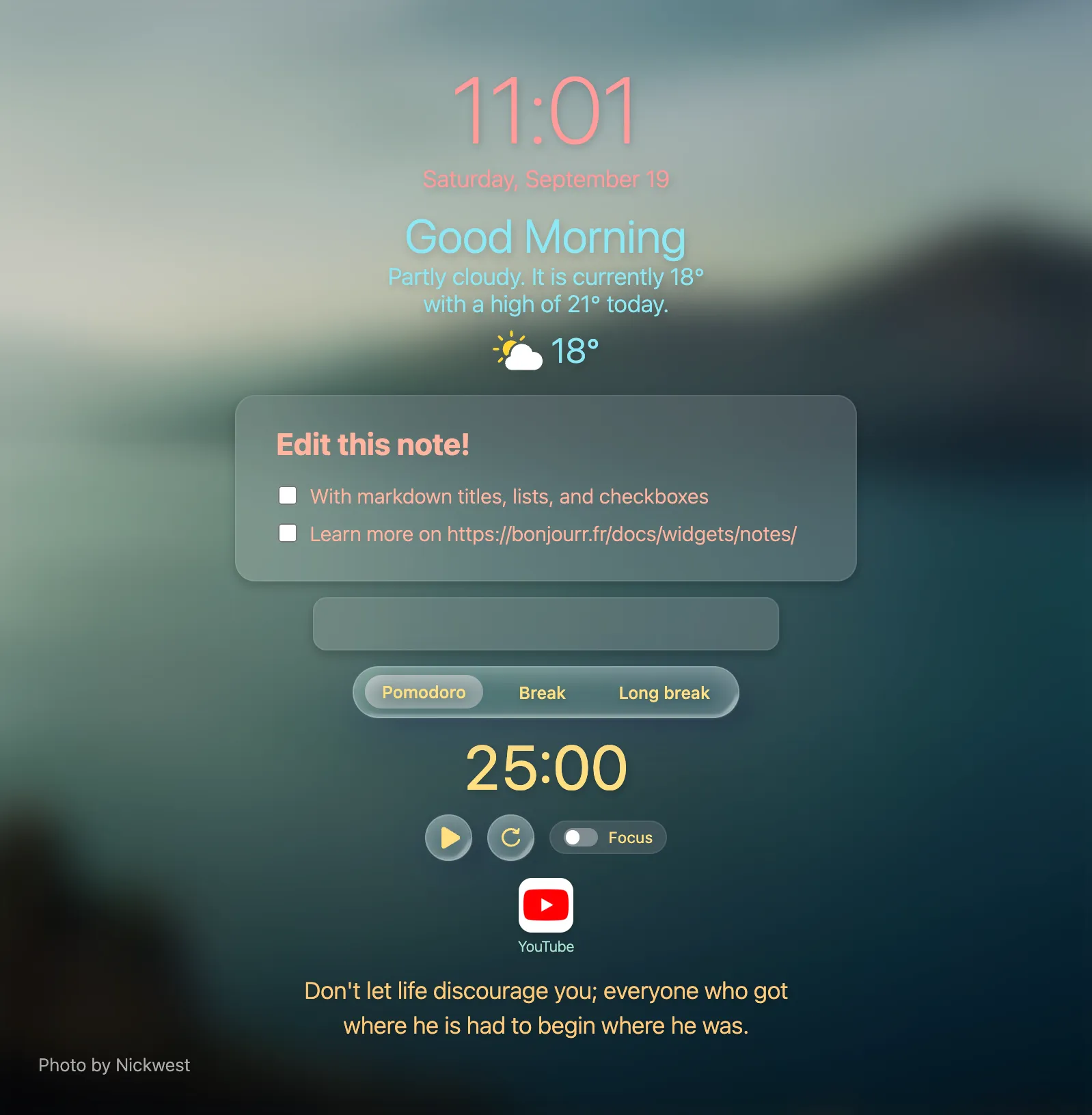
Section intitulée « Personnaliser les couleurs des widgets individuellement »Si vous souhaitez avoir encore plus de contrôle sur les couleurs du texte, vous pouvez les modifier individuellement pour chaque widget.
Voir l’extrait CSS
/* time and date */#time {  color: #FF9B9B;}
/* weather and greetings */#main {  color: #8DE8F5;}
/* pomodoro */#pomodoro_container,#pomodoro_container .glass,#pomodoro_container #bottomControls {  color: #FFE082;}
/* search bar and suggestions */#sb_container #searchbar,#sb_container #sb_empty,#sb_container #sb-suggestions {  color: #D5B8F5;}
/* notes */#pocket-editor {  color: #FFB49F;}
/* quick links */#linkblocks {  color: #A8E6CF;}
/* quotes */#quotes_container {  color: #FFC978;}
Icônes météo personnalisées
Section intitulée « Icônes météo personnalisées »
Voir l’extrait CSS
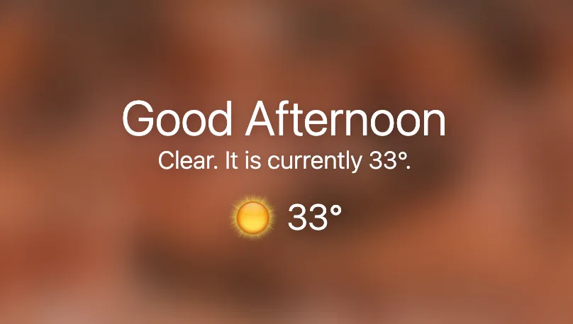
    /* overrides the default weather icons */
/* replaces the day clear sky icon */.weather-icon#weather-day-clearsky {    /* set any direct URL to an image */    background-image: url("https://i.imgur.com/OYUvHWD.png");}
/* hides the default weather icon */.weather-icon * { display: none;}| Icône | Condition | ID jour | ID nuit |
|---|---|---|---|
| Nuages fragmentés | weather-day-brokenclouds | weather-night-brokenclouds | |
| Ciel dégagé | weather-day-clearsky | weather-night-clearsky | |
| Quelques nuages | weather-day-fewclouds | weather-night-fewclouds | |
| Pluie légère | weather-day-lightrain | weather-night-lightrain | |
| Brouillard | weather-day-mist | weather-night-mist | |
| Ciel couvert | weather-day-overcastclouds | weather-night-overcastclouds | |
| Pluie | weather-day-rain | weather-night-rain | |
| Neige | weather-day-snow | weather-night-snow | |
| Pluie et soleil | weather-day-sunnyrain | ||
| Orage | weather-day-thunderstorm | weather-night-thunderstorm |
Icône des paramètres personnalisée
Section intitulée « Icône des paramètres personnalisée »
Voir l’extrait CSS
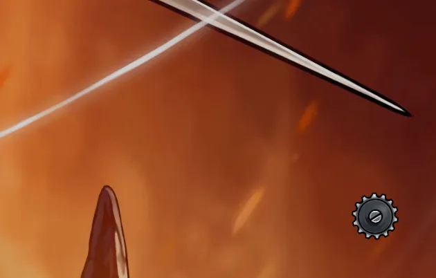
/* custom settings icon */
#show-settings svg {  /* replace the link with any other direct URL to an image */  background-image: url("https://i.imgur.com/n6C8rGA.png");  background-repeat: no-repeat;  background-position: center;  background-size: contain;}
#show-settings svg * {  display: none;}
Barre de recherche
Section intitulée « Barre de recherche »Arrondir la barre de recherche
Section intitulée « Arrondir la barre de recherche »
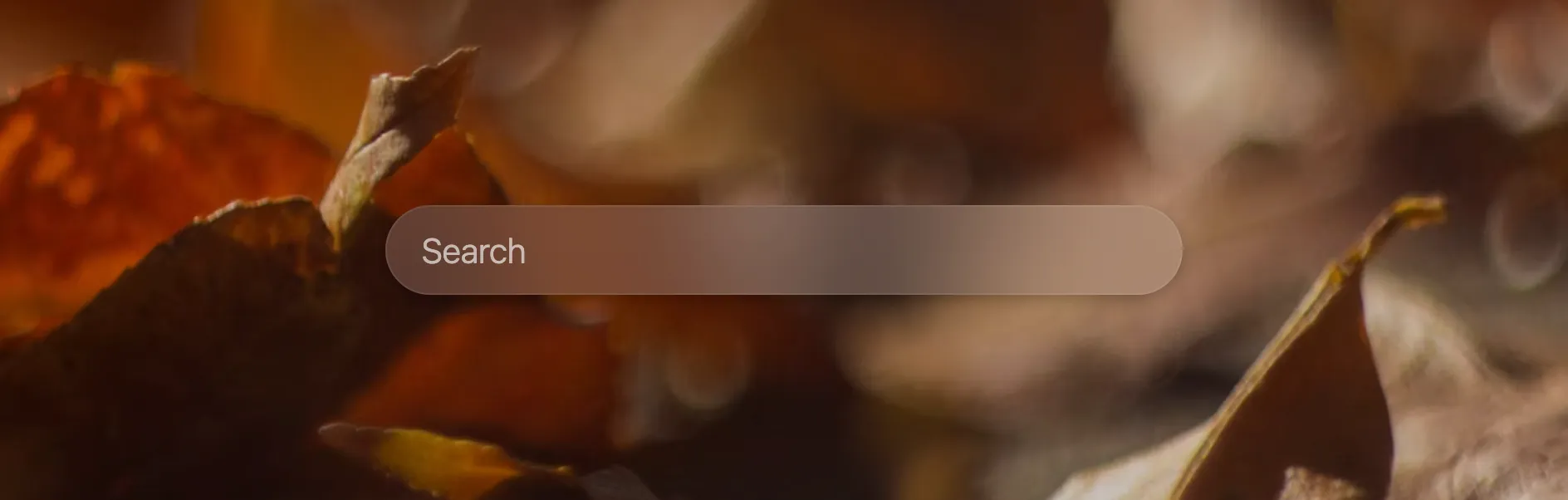
Voir l’extrait CSS
/* round searchbar */#sb_container, #searchbar-wrapper { border-radius: 100px;}Ajouter un logo à gauche de la barre de recherche
Section intitulée « Ajouter un logo à gauche de la barre de recherche »
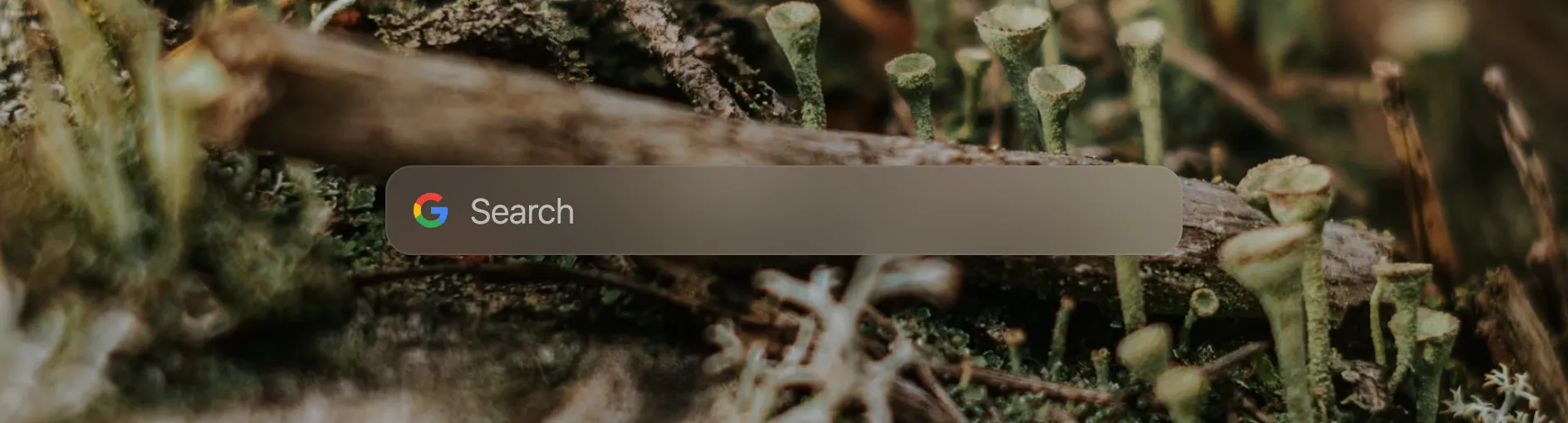
Voir l’extrait CSS
/* adds logo to the searchbar */#searchbar { /* use any direct link to an image you want */ background: url('https://upload.wikimedia.org/wikipedia/commons/c/c1/Google_%22G%22_logo.svg') no-repeat 15px center; /* you might need to play around with the two following values to get to a fitting result */ background-size: 23px; padding-left: 47px;}Proposé par Kim Visnes
Police personnalisée pour l’horloge
Section intitulée « Police personnalisée pour l’horloge »Remplacez les noms des polices par n’importe quelle police installée sur votre ordinateur. En savoir plus
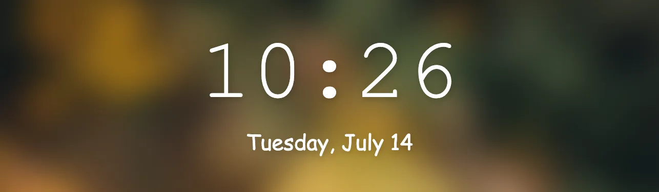
Voir l’extrait CSS
.digital {  font-family: "Courier New";  /* the higher the number, the bolder */  font-weight: 400;}
/* You can do the same with the date */.clock-date {  font-family: "Comic Sans MS";  font-weight: 400;}
J’aime mes horloges épaisses
Section intitulée « J’aime mes horloges épaisses »Rend l’horloge analogique plus épaisse.
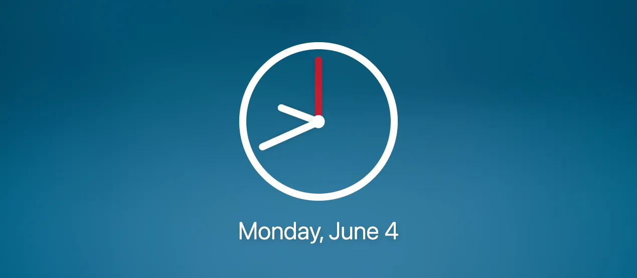
Voir l’extrait CSS
/* change analog clock width */.analog {  border: calc(var(--clock-size) * 0.4) solid;}
.analog-minutes, .analog-hours, .analog-seconds {  width: calc(var(--clock-size) * 0.4);}
.analog-center { width: calc(var(--clock-size) * 0.7); height: calc(var(--clock-size) * 0.7);}Transforme l’horloge analogique en Rolex.
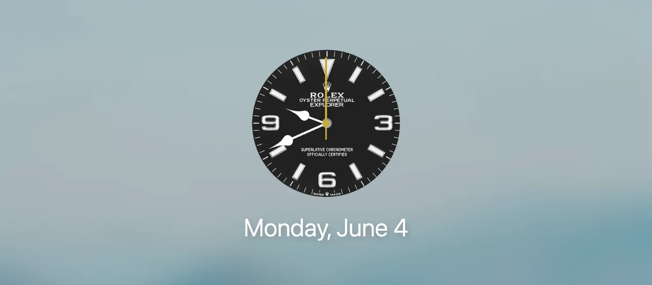
Voir l’extrait CSS
/* Rolex 😎 */.analog-face,.analog-face:hover {  border-radius: 100%;  background-size: cover;  background-image: url('https://i.imgur.com/AYupb7G.png');  /* light version  background-image: url('https://i.imgur.com/TT3oBcz.png'); */}
.analog {  border: unset;}
Liens rapides
Section intitulée « Liens rapides »Effet verre dépoli sur les liens
Section intitulée « Effet verre dépoli sur les liens »Vous en avez assez du fond blanc des icônes, mais vous souhaitez tout de même conserver un arrière-plan pour vos liens ? Cet effet de verre dépoli pourrait davantage vous plaire.
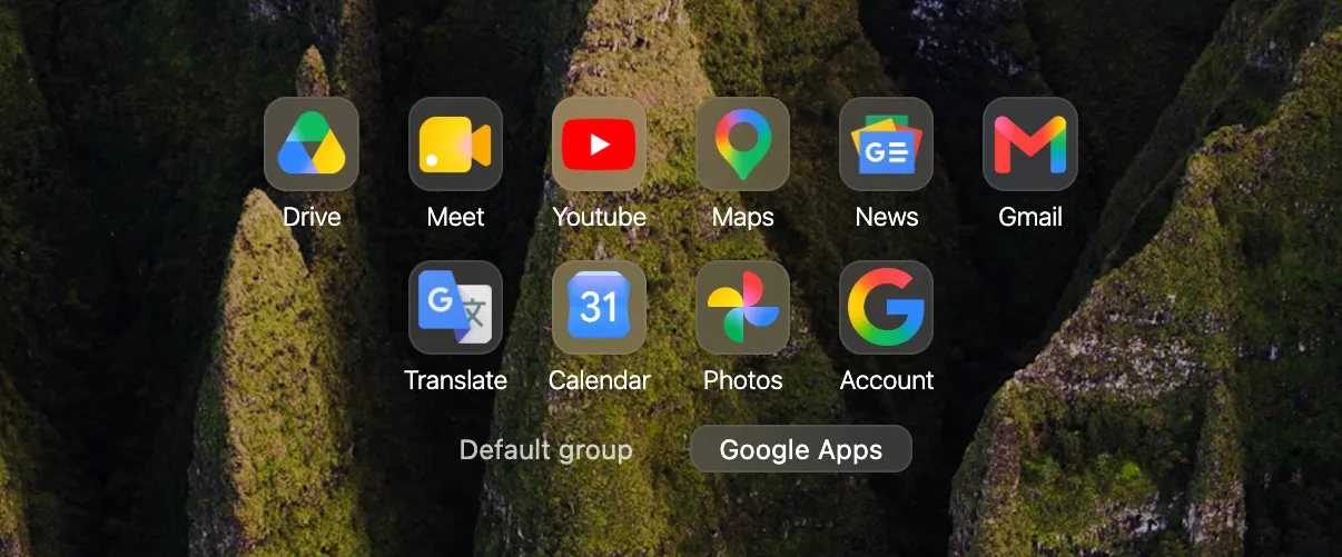
Voir l’extrait CSS
.backgrounds .link .link-icon { background-color: #fff2; backdrop-filter: blur(2em); border: 1px solid #fff1;}Limiter mes liens rapides les plus visités
Section intitulée « Limiter mes liens rapides les plus visités »/* Sets a limit to your most visited links (replace 5 with how many links you want) */.synced .link-list > :nth-child(n+5) { display: none;}Arrière-plans
Section intitulée « Arrière-plans »Contenir l’arrière-plan (utile pour les images en portrait)
Section intitulée « Contenir l’arrière-plan (utile pour les images en portrait) »Lorsque vous souhaitez utiliser des images en portrait comme arrière-plan, il peut être intéressant de les afficher sans les recadrer.
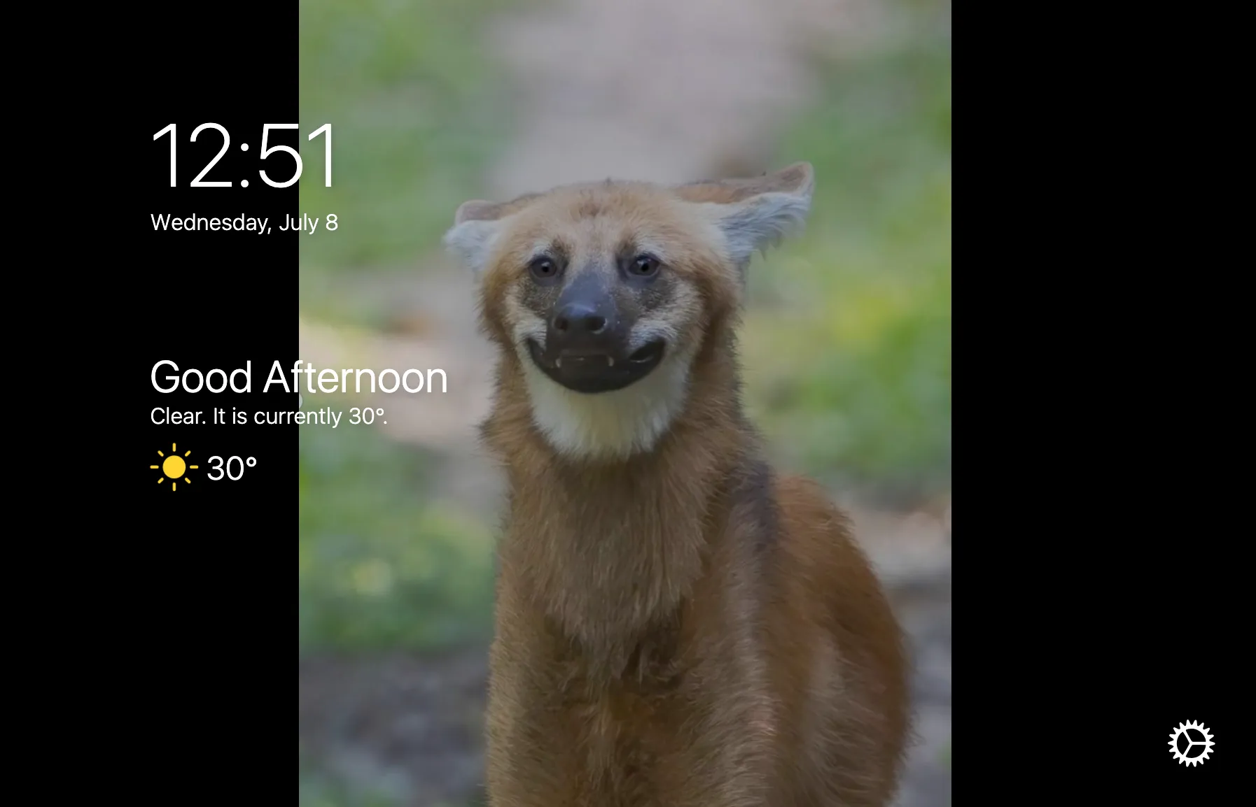
Voir l’extrait CSS
/* shows the full background image with no cropping (black bars), useful if you have a portrait orientation background */#background-media .background-image {  background-size: contain!important;  background-repeat: no-repeat;  transform: scale(1); /* try 0.9 if you want margins at the top and bottom as well */}
body { /* accepts any hexadecimal color value, like #417781 */ background-color: black;}Arrière-plan transparent (navigateur Zen)
Section intitulée « Arrière-plan transparent (navigateur Zen) »
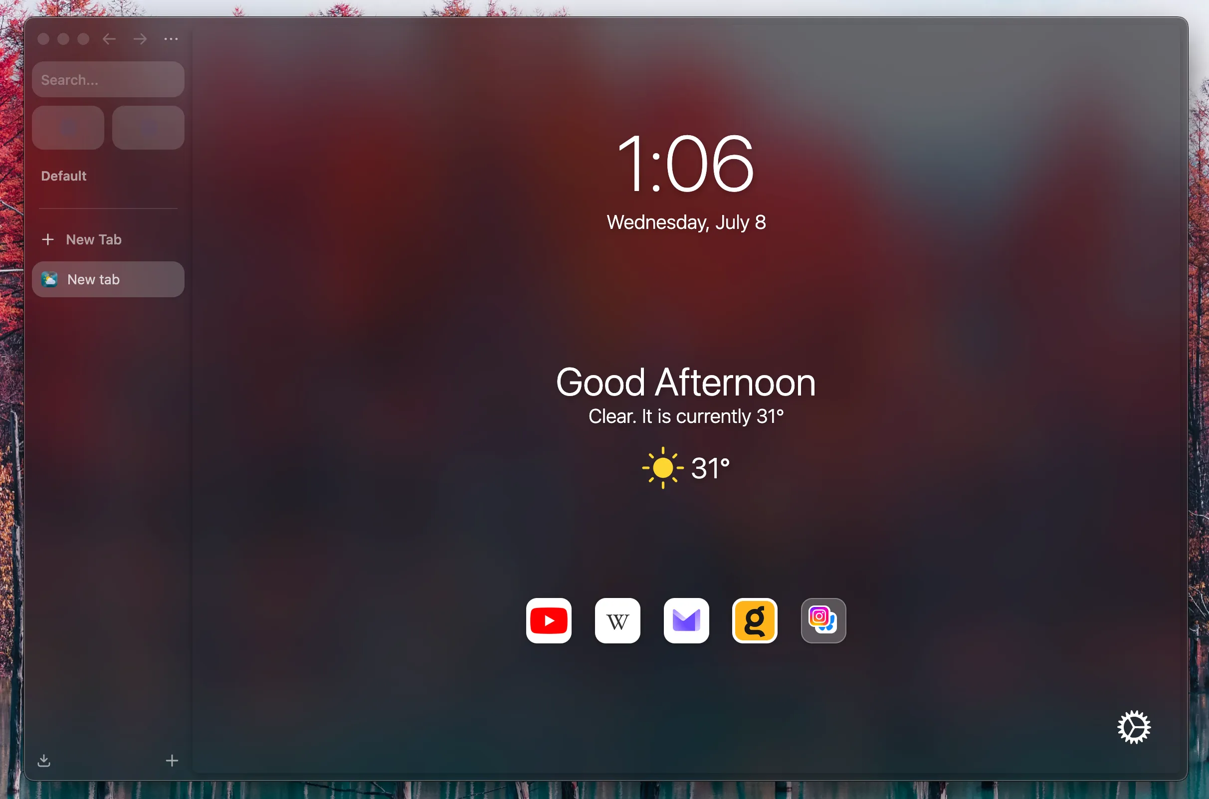
Voir l’extrait CSS
/* Hides regular backgrounds to make Bonjourr transparent. */#background-media, #background-color {  display: none!important;}
.tabbing {  background-color: transparent !important;}
body {  background-color: transparent !important;}
#credit {  visibility: hidden;  opacity: 0;  transition: opacity 0.4s, visibility 0.4s;}
#credit-container:hover #credit { visibility: visible; opacity: 1;}Je me fiche de la mise en avant des artistes
Section intitulée « Je me fiche de la mise en avant des artistes »/* Hides photo author credits. */
#credit { visibility: hidden; opacity: 0; transition: opacity 0.4s, visibility 0.4s;}
#credit-container:hover #credit { visibility: visible; opacity: 1;}Pas de GPU, uniquement le CPU 😠
Section intitulée « Pas de GPU, uniquement le CPU 😠 »/* This disables graphics intensive "backdrop-filter" style property on some elements. */
#bookmarks_container,#bookmarks,#element-mover,.move-overlay { backdrop-filter: none !important;}
#editlink,#bookmarks,#element-mover { background-color: #f2f2f7;}
body.dark #editlink,body.dark #bookmarks,body.dark #element-mover,body.autodark #editlink,body.autodark #bookmarks,body.autodark #element-mover { background-color: #222;}Pour les ordinateurs peu puissants
Section intitulée « Pour les ordinateurs peu puissants »Cela peut améliorer les performances de Bonjourr sur du matériel plus ancien
/* Disables most settings transitions and animations. */#settings .as,#settings,.move-overlay {  transition: none;}
#interface {  transform: translateX(0) !important;  transition: none !important;}